
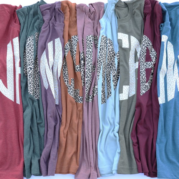
Monogram Leopard Tees
My initials in that circle font look terrible!! The L’s don’t match, I mean they don’t even resemble each other at all. (LWL) The only initials used in the photos are all proportioned and look so pretty. I don’t recommend this font unless your monogram is KMB.